Reverb Search UX
Search can be a frustrating experience for users, especially on a mobile device. If search results do not meet expectations - user intent, specificity, guidance - users will abandon and leave.
The goal of this project was to identity common pain-points in the Reverb search journey, and make UX recommendations to resolve them. Some of the solutions are purely design and content related, while others required substantial technical investment over time.
Role: Director of Product Design
UX and IA: Raphy Fedida

What Reverb users told us:
“Reverb doesn’t understand my search intent, so I don’t see the results I’m expecting.”
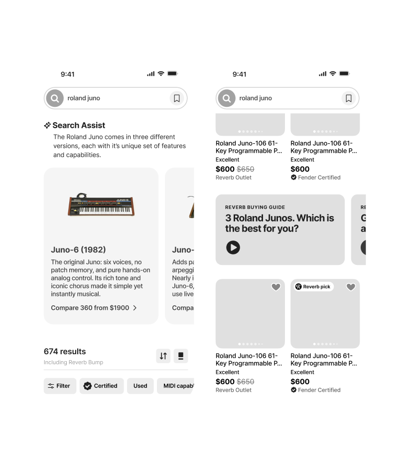
How might we infer user intent based upon their search query, and adjust display contents accordingly?
A question I asked myself:
Product recommendation
By better understanding search intent, we can determine why a user is searching, how ready they are to buy, and what they might expect to see next.
If the query is broad, like a brand

Understanding ambiguous intent
The user may be browsing broadly, and open to discovery. Or they might be a more savvy user following a specific set of familiar steps to get to a desired result.
Brand affinity
They already trust or admire a brand like Fender. They might be loyal to the brand but undecided on what to buy.
Top of funnel
They’re likely in a consideration phase (window shopping), and not in the purchase phase.
How might we adapt?
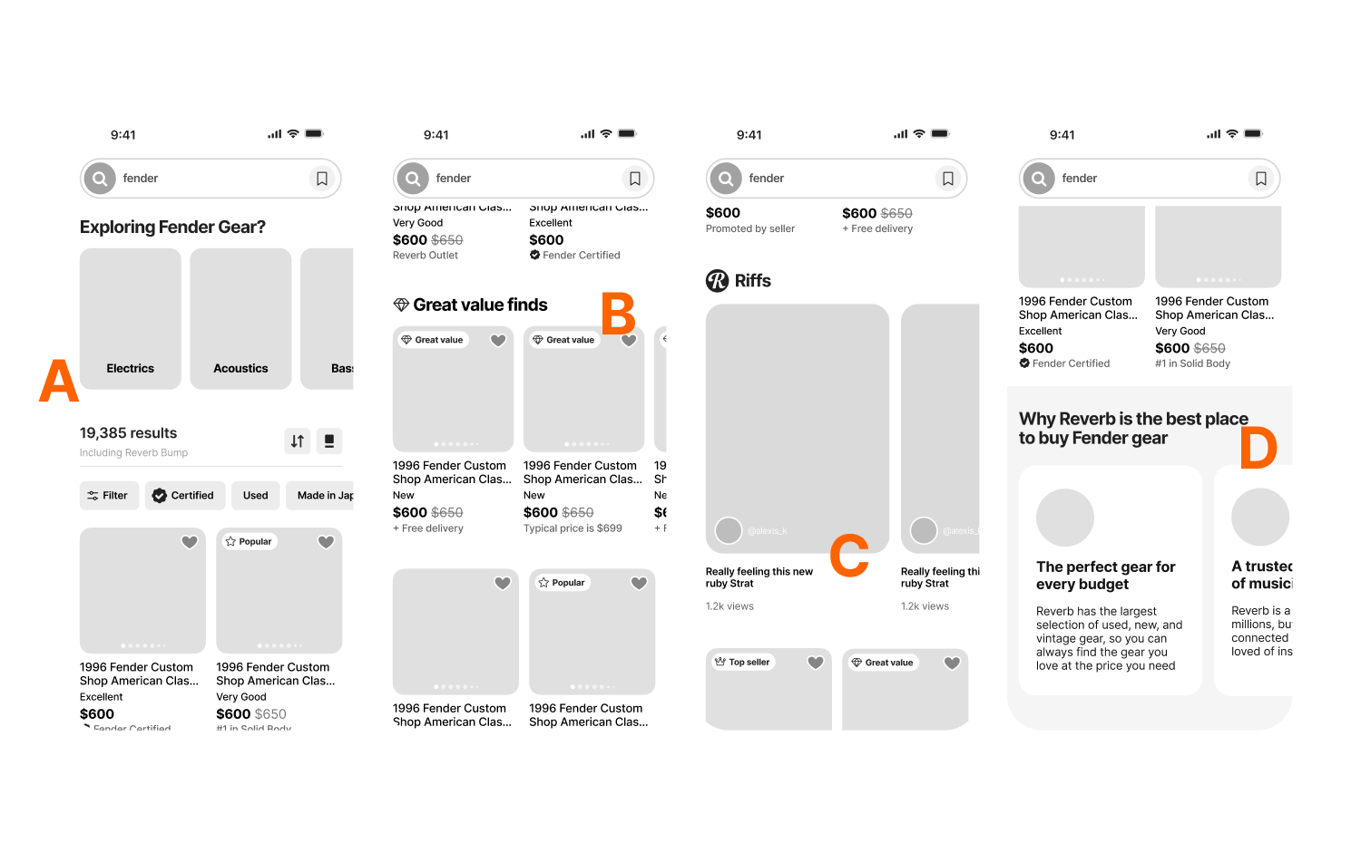
A. For users in exploration mode, provide one-tap visual category filters to help move them down the funnel towards the gear that inspires. B. For users with greater intent, lead with our best gear (greatest value), and clear paths to navigating results. C. In all cases, insert relevant content within the grid that inspires and educates, and that highlights Reverb’s gear expertise and our community of musicians. D. Highlight what makes Reverb unique, and what makes it the best place to buy used gear.
If the query is specific, like a product

High purchase intent
The user generally knows what they want and are comparing based upon price, condition, or seller.
Product literacy
The user likely has some understanding of models, specs, and features.
Later-stage decision
The user is narrowing the options down and is closer to a purchase decision.
How might we adapt?
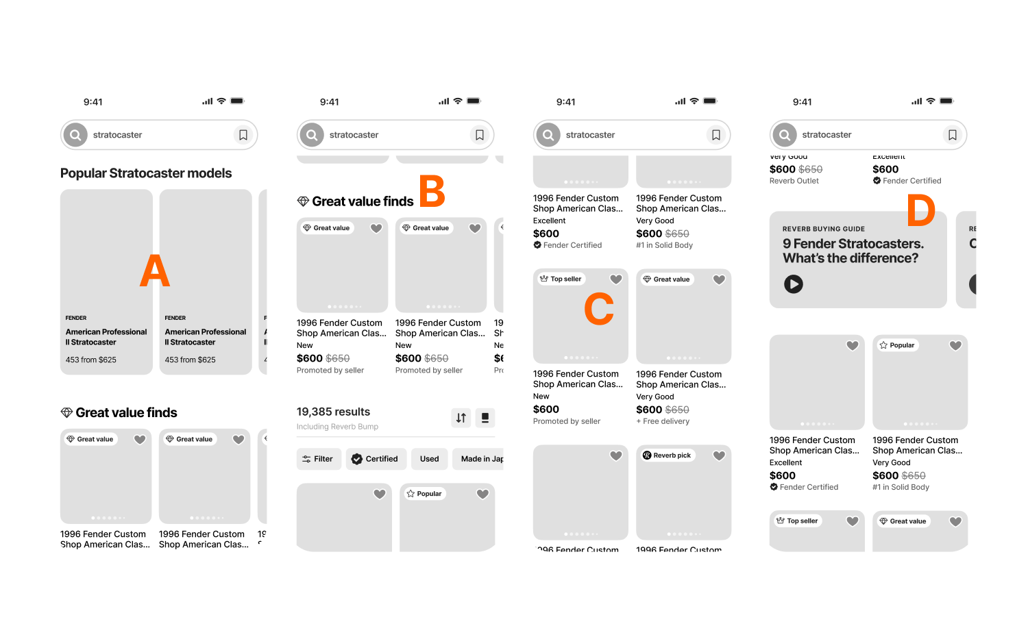
A. Shift to a decision-first layout. B. Lead with our best gear, representing the greatest value. C. Emphasize trust signals, condition, and price transparency. D. Highlight Reverb’s gear expertise and our community of musicians.
What Reverb users told us:
“Reverb doesn’t show me search results with the greatest value in mind.”
How might we lead with great value and trust?
A question I asked myself:
Product recommendation
Trust cues signal reliability, safety, and credibility to users - especially at moments of comparison and purchase decisions.
Leading with value and trust

Visible trust signals: the what and the why
Prominently display seller trust badges, value badges, value scores, and community popularity. Explain why trust signals are present, and the meaning behind them.
Smarter patterns
Use human-centric curation and language: Preferred sellers, Pro picks, Trending now, etc..
Curated discovery rows
Reframe “cheap” as “great finds,” curated by the musicians at Reverb, and elevates value thru storytelling
The ‘what’ and the ‘why’
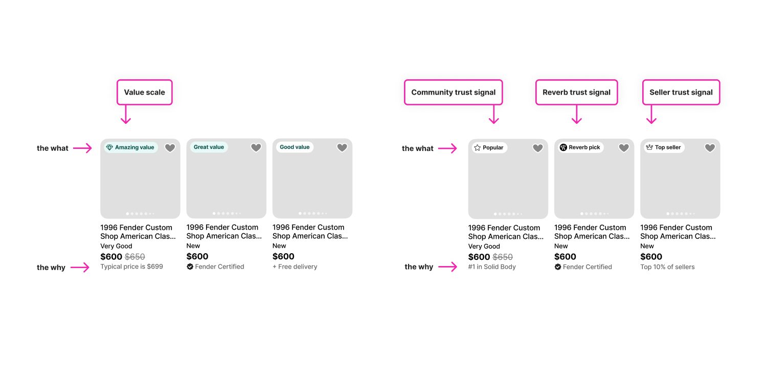
Simply placing value badges on item cards is not enough. To inspire trust, it’s necessary to show why the badges are present.
What Reverb users told us:
“When browsing search results, it’s too difficult to narrow the results according to details important to me.”
How might we make search refinement easy and helpful?
A question I asked myself:
Product recommendation
Filters are not simply a convenience. They’re an essential tool for narrowing down a large set of results and getting to the right gear faster. They’re a conversion engine.
Make is easy(er)
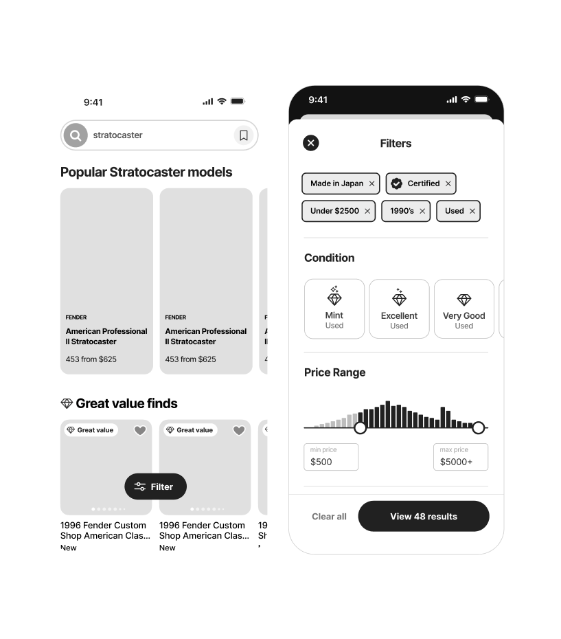
Surface only the filters that match the query
Filters should appear relevant to the search query, not generic.
Improve the ergonomics on mobile
Filtering on mobile is challenging and easily abandoned. Improve the filtering experience with easily accessible buttons, generous spacing, large tap targets, color cues, and prioritization based upon usefulness.
Improve the management of selected filters
Consolidate pre-selected and user-selected filters so that users don’t have to locate them within a large filter menu in order to turn them off.
What Reverb users told us:
Reverb doesn’t guide me along my buying journey, especially when I need help making choices. What I get is an overwhelming number of search results with no clear way to navigate to next steps
How might we guide and inspire users towards the best gear for them?
A question I asked myself:
Product recommendation
Users don’t want infinite choice. They want the feeling that Reverb gets them, and has the expertise to guide them towards a confident choice.
Guide and inspire
Emphasize gear expertise
Help guide users to the best choice for them by emphasizing our gear expertise. Use plain language to help customers navigate the differences between gear variations.
Just in time
Present content and human-curation that guides and inspires at the right moments that helps users make more confident decisions, and builds trust with Reverb.
Community
Emphasize the community of musicians on Reverb, through short-form UCG vertical video and public gear collections, for example, and lean into the idea that community creates a feeling on belonging.
Looking ahead
How might we make search and discovery more human and expressive, and reduce the user-effort required to find the best gear for them?
Human and expressive
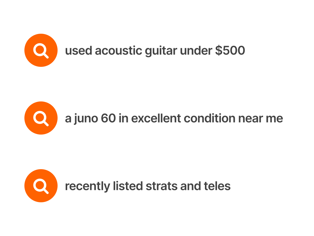
Natural language
Allow the use of natural language and sequences of keywords and preferences, and combine that with what’s known about the user.
Human
Typos will happen. Understand user intent and offer the expected results. Account for gear abbreviations, slang, and other common alternative language for gear.
Trust
Through a combination of understanding user intent, and our gear expertise, take the work out of finding the best gear.